Pantone 2014 Color of the Year – What does it mean for you?
Earlier this year, we shared a post announcing Pantone’s color of the year. Here to share her perspective on this color is our Design Editor, Susan Rayner. ~KG
~ By Susan Rayner, Design Editor ~
Did you know there’s a color of the year? Out of the infinite number of colors that exist how does one color reach this pinnacle of success, you ask? Because the folks at Pantone decree it so, that’s why.
So who is Pantone and how did they get this honor? Pantone is a company and a color system and they select the color of the year, because, well, they thought of it first, that’s why. Pantone describes themselves as “the world-renowned authority on color . . . for the selection and accurate communication of color across a variety of industries”. Translated this means that an advertising manager in London can tell a graphic designer in Denver to use Pantone Gold Flame and be assured that the color in the final ad will be the one she was envisioning.
But the color of the year is more than just good PR for Pantone. The selected color frequently is a predictor of what you will start to see in advertising, packaging, fashion, cars and more. To determine this color Pantone scours the planet looking at social, technology, lifestyle, economic and art trends. They collect all this data and magically end up with one color that reflects the “global zeitgeist”. (They are also not shy about using hyperbole.)
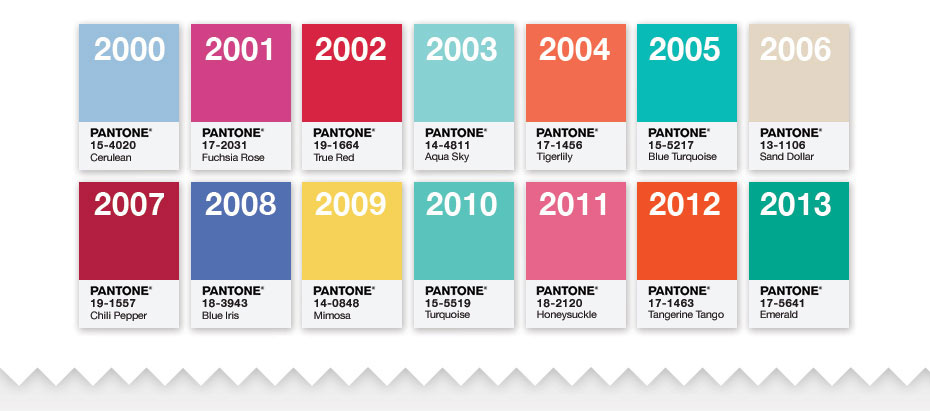
Image courtesy of pantone.com
Color of the Year 2000 – 2013
And the color for 2014 is . . .
Radiant Orchid
(When regular old orchid is just not enough!)
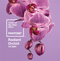
Image courtesy of pantone.com
Sounds great, but what has this to do with my house you’re asking? Well, what happens in the world of fashion frequently drives what happens in interior design – usually a year or two down the road as people don’t change out their interiors like they do their outfits. For instance, I’m seeing a lot more orange in interiors since Tangerine was the 2012 color of the year.
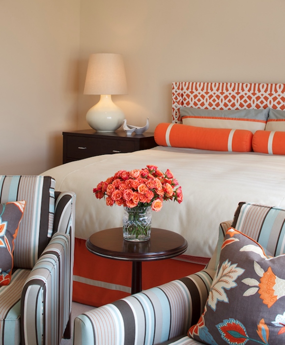
Image courtesy of Artistic Designs for Living – adlsf.com.
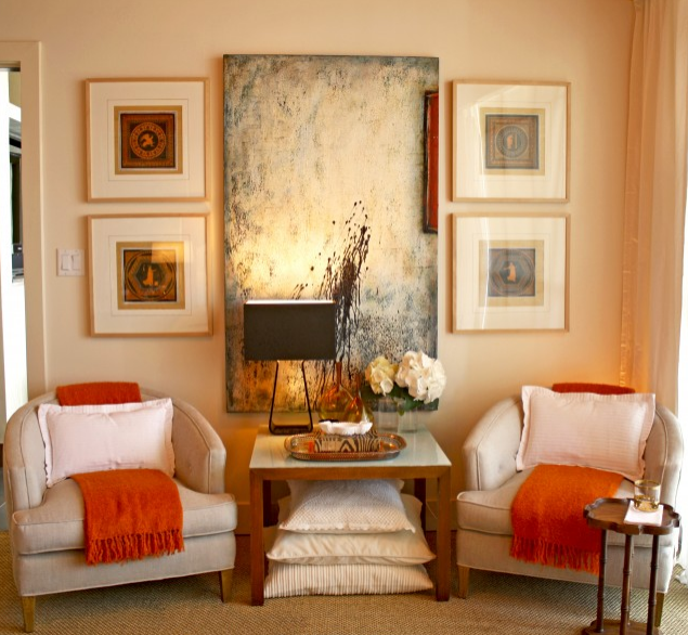
Image courtesy of Domicile Interior Design
Beautiful! Once orange was a color reserved for fast food restaurants but no more. We’ve seen how stunning it can be in your home, as in these rooms.
I’ve always loved orchid – my favorite winter scarf is this color and it’s the perfect winter pick-me-up.

It’s fuchsia with just enough purple to give it that extra jolt. While not many people will be upholstering their new sofa in orchid, don’t be surprised to see this color pop up as an accent – especially in bedrooms and baths.
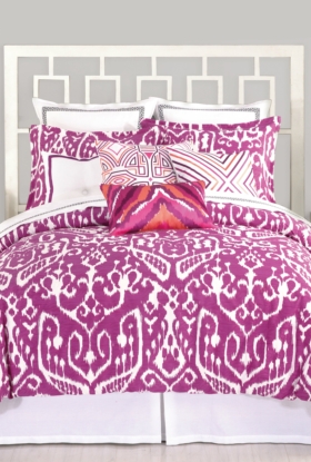
Trina Turk Ikat Bedding via trinaturk.com
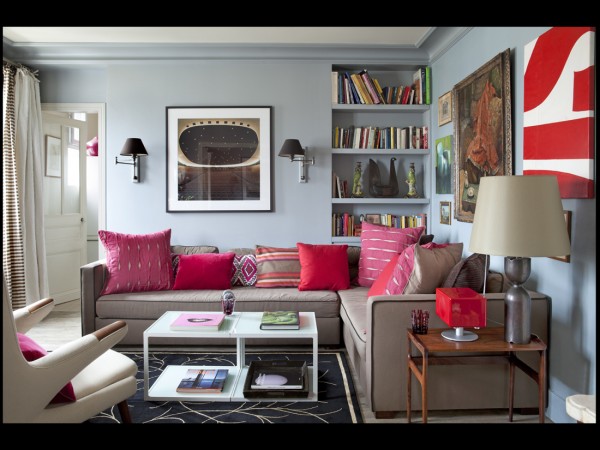
Orchid and red sofa pillows. Image courtesy of elle.fr.
But if you like it, no need to hold back. Feel free to use it more freely, as in this dining room.
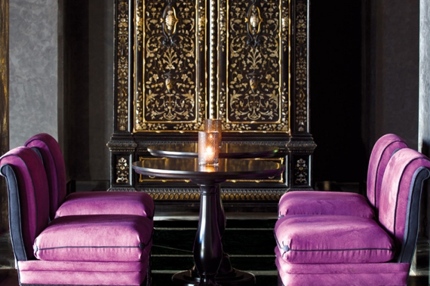
Selman Marrakech Hotel
Or use its close cousins, plum and lilac, as in the living rooms below.
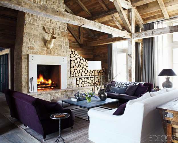
Image courtesy of elledecor.com
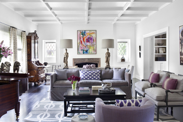
Image courtesy of burnhamdesign.com
And who doesn’t love an actual orchid?
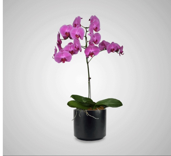
Image courtesy of InteriorPlantscapesllc.com
Love it, hate it or indifferent – I think you have to admit that it’s a nice antidote to Chicago Winter Sky, the color I’ll be seeing a lot of for the next few months, soon to be followed by Chicago Dirty Snow. I think I need a vacation!
 Owner of Susan Rayner Interiors, Susan’s aesthetic is clean and classic, whether the style is modern, traditional or somewhere in between. She is passionate about creating positive change for her clients while allowing them to control their costs. Susan has a friendly, collaborative approach that allows her clients to enjoy the design process. This ensures they will love the end result – a house they enjoy coming home to!
Visit Susan at SusanRayner.com.
p.s. Want to hear more from Susan about 2014 residential interior design trends? Check out this episode of the Power Up Living radio show.

About the author, Kelly
Kelly Galea is a creative, multi-passionate entrepreneur and luminary blessed with a unique combination of wit, grit, intellect and intuition. She helps you navigate the work-life maze of ever-shifting priorities and transform your life through holistic self-discovery techniques and immersive, fun and magical mini-quests. Working with Kelly will inspire you to unveil, express and celebrate your vital personality and lifestyle preferences to create a more harmonious life.